
Kam Seidl — Senior UI/UX Designer
Kam Seidl UI/UX
Open to Senior & Lead UX roles Atlanta, GA

Kam Seidl

Thirteen years across live-service games, SaaS platforms, mobile titles, and client work. A shooter played by millions, a quarterback training platform, slots built under licensor review, a consultancy selling to federal agencies and small businesses at once.

The constant across all of it is how I work: find the goal, find what's in the way, and remove it.

Selected work

Product & Web
Mobile Web portal SaaS

Crucible

Product Design · UX / UI · Product Marketing

A mobile app and a web portal for two different users: coaches build lesson plans and custom plays in the web portal, then push them to the team, where players run them in a 3D simulation.

Sales up 45% after my additions shipped.

View case study →
yourvcs.com One company.
Two markets.
Federal agencies and small businesses, one site
Web Brand Creation Client sites

VCS

UX / UI · Brand identity · Client sites

Custom sites for multiple audiences, brand identity, site assets, and custom tools and AI built in wherever the client needed them.

Each client got a site designed around their own brand.

View case study →
Games
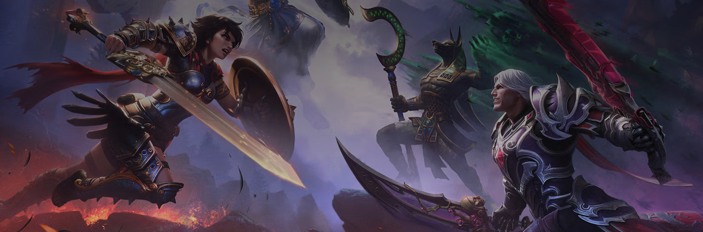
Hi-Rez Studios PC / Console Live service

Smite 2

System design · Modernization · Retention

Reimagined core out-of-game systems for the sequel, simplification first, boutique themed UI second.

A modern front end a returning audience does not have to relearn.

View case study →
Hi-Rez Studios PC / Console Live service

Paladins

Sole → Lead UI/UX · Retention · Monetization

Rebuilt the out-of-game experience of a nine-year live shooter: store, inventory, quests, daily login, and per-champion HUDs.

Cut the 7-click purchase flow, four clicks above the genre standard.

View case study →
Zynga Mobile Live service

Wizard of Oz:
Magic Match

Research · Retention · Modernization

Four programs on a declining match-3 title: two new features, a UI modernization, and an outsourcing pipeline.

Includes the redesign that failed, and what I did next.

View case study →
What leads say

“Kam absolutely owned UI/UX as a single individual. She was self-sufficient, self-managing, and clear on her tasks. It was a massive relief to have a pro at the helm.”

Daniel Lilleberg
Executive Producer and Art VP at Hi-Rez Studios
Read all recommendations →

Hiring for UX?

My resume is one click away, and I answer email the same day.

Kam Seidl

I've designed for casino floors, card game economies, and quarterback film study. Each time, my first job was the same: figure out what the person using it needs, quickly.

Thirteen years of it. Seven in web and PC, six in mobile, across industries that share almost nothing.

Live titles with fixed ship dates taught me to plan the day a project is approved and to work agile beside the engineers building it. I have led a team and I have been the only designer in the room, and I am better for having done both.

When a domain is new to me, I learn enough to be useful and ask the people who live in it for the rest. I had never called a football play before Crucible; the coaches and players filled in what I didn't know.

Most recently I've been applying what I learned in games to SaaS. Past teams include Scientific Games, Caesars, Zynga, Hi-Rez, and Crucible.

Recommendations

“Kam’s exceptional creativity, technical expertise, and pragmatism have made a significant impact on the game we worked on, and I am confident that she will be an invaluable asset to any team she joins.”

I had the privilege of working with Kam for the past three and a half years at Hi-Rez Studios, where she, as sole and Senior UI/UX Designer on Paladins, reported directly to me.

Kam played a critical role in the design and implementation of several major features in Paladins, including the Daily Login and Quest systems, custom mutators for game modes, and the complete rework of the Item Store UI in the Siege: Beyond update. Her ability to manage large-scale design projects, deliver polished, intuitive user interfaces, and collaborate across disciplines, often under tight deadlines, was instrumental to the game's success.

Kam took point on several process improvements and helped to establish best practices on Paladins. She was pivotal in prioritizing UI/UX features and managing project milestones to align with tight deadlines. Her mentorship and knowledge-sharing helped integrate newcomers into the team swiftly and effectively.

She has a keen eye for monetization opportunities, and her work on high-impact features like the Trials Rework, UI Style Guide, and Bounty Store UI directly contributed to improved player retention and engagement. I enthusiastically recommend Kam.

Daniel Fishman
Lead Game Designer and Mentor at Hi-Rez Studios

“The game industry is actually behind on UX and usability, and the key is an understanding of basic UX from other fields and the new emerging language in games. It’s vital, and Kam is pushing forward with those sensibilities.”

It’s awesome to hear about someone and see their work building a clear reputation of passion and consistency, and it’s even better to get a chance to work with that person. As a long-time employee on Paladins, I knew its UI needs back to front, and when I was moved to other teams I was hoping the project would get the talent it needed.

Even being on another team with light crossover, it was clear that Kam was that person. Just seeing the effort, the attention to detail, and the ambition of quality that Kam would post on JIRA was worth keeping your eye out for.

UI is complicated; the venn diagram of cosmetic needs and UX needs is hard to parse and even harder to explain, but so clear when it’s all done right. Kam lived up to the reputation of her passion and energy.

Casey Edwards
Art Director and Character Concept Artist at Hi-Rez Studios

“Kam absolutely owned UI/UX as a single individual. She was self-sufficient, self-managing, and clear on her tasks. It was a massive relief to have a pro at the helm.”

I could tell directly that she took full responsibility for her portion of the pipeline. As the new EP on a team that had just undergone staffing reductions, I was concerned for every portion of the pipeline still being able to function, and it was a massive relief to see that Kam was fully on top of her role.

She had already made adjustments with the shifting sands on the project team and was focused on keeping things moving. Kam, alone handling UX/UI as well as UI Art, was not a part of the project I had to be concerned about. I would definitely recommend her as someone who is very reliable and passionate about her role in game development.

Daniel Lilleberg
Executive Producer and Art VP at Hi-Rez Studios
← All work
Product Designer Web Mobile SaaS

Crucible

I designed both sides of Crucible's quarterback training platform: a web portal where coaches track analytics and build game plans, and a 3D decision simulator where players learn and run them.

Role

Product Designer

Responsibilities

Product strategy, UX/UI design, interaction design, information architecture, design system implementation, prototyping, onboarding, content modeling, product marketing, marketing site

Team

Founders, backend and frontend engineers, and football subject-matter experts

Tools

Figma, Adobe CC, Unity, Claude, VS Code

Timeline

Nov 2025 to present

I defined the brand's look here, on the marketing site, before it carried into the product. Visit crucibletech.com ↗
01

The web portal: everything a coach needs

I led the design of the web portal and helped build it. It's the coach's hub: one place to track players and shape a digital playbook, working in tandem with the mobile app players use every day.

Core features I spearheaded:

Player analytics

Drill down from the full roster to the one metric, like reaction time, that shows exactly where a player needs work.

Terminology customization

Coaches rename plays in their own language, then push those terms straight to the mobile app.

Custom game plans

Coaches build targeted lessons and plays in the portal, delivered to players' mobile app, which reports scores back.

In progress

Whiteboard to 3D simulation

A 2D whiteboard where a coach sketches a play, and AI turns it into a 3D simulation the player runs in game.
02

Offensive Info: play recognition as flashcards

Our user base had a wide range of understanding, from zero football knowledge to pros. I pulled play recognition into its own flashcard system, built to flex with however much a player needed.

{{ s.alt }}
{{ oiCaption }}

Learn mode

Terms got split into stacks of ~20, so a new player could make progress in sections instead of facing the whole set at once.

Built for every level

One system built to work for a rookie and a pro at once: basics for one, a straight shot to scoring for the other.

Test mode

Accuracy came first: speed was only scored once a player hit 100%, tracked as a stat pro players could flex.

Built to improve

A slow right read is still a sack, encouraging quicker accurate recall.

Design detail

Color customization

The organization sets its own palette, and I carried it into the mobile app, so a player could tell at a glance whether they were in their team's version of the app or Crucible's default.

03

QB Lab: a learning loop in front of the simulator

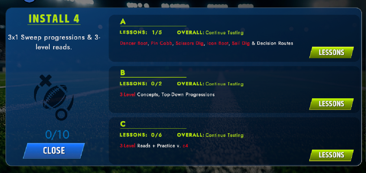
Installs are graded modules that combined multiple choice, tests, and required 3D simulation runs into one unit. Coaches got the same tools in the web portal to build or adjust lessons and assign them to players.

A QB Lab install expanded to show its lessons, their progress, and the concepts each one covers
An install opened up: each lesson carries its own progress, status, and the concepts it drills. Red text shown here is dynamic text, only shown this way to developers.

Two ways to build a lesson

Normal mode pulls from plays a coach already chose, Expert mode opens the full library.

Their words, not ours

Every module and play name uses the organization's own terminology, not Crucible's.

Order is teaching

Coaches set their own teaching order, because the order plays are taught in is a coaching decision.

04

Easing the friction in what already shipped

I built an AI layer that reads signup signals to identify coach or player, using link origin or QR code to personalize onboarding.

Targeted from the first email.

Before
Sign up
Same intro emails
Same setup links
After, with AI
Sign up
Use case identified
signals: event, page, QR code
If unclear,
ask coach
or player
Matched emails + setup links

Outcome

Sales rose 45% once my additions shipped.

Engineering rollout ran behind the design work, the trade you make at an early-stage company. I scoped the designs to what the team could build at the time.

← All work
V Consulting Services Marketing site · Brand UX Designer · Tech Ops

VCS

VCS sells AI automation to two audiences with nothing in common: federal contracting officers and small business owners. I designed and built the site that has to convince both, then designed sites for their clients.

Role

Brand and UX Designer

Responsibilities

UX and UI, brand identity, client site design, site architecture, content structure and search, build and technical operations

Team

Contractor working directly with clients across sports, hospitality, and legal

Tools

Figma, Adobe CC

Timeline

Aug to Dec 2025

{{ s.alt }}
{{ vcsCaption }}
01

Two audiences, one front door

A contracting officer needs SAM.gov status and NIST alignment before anything else. A small business owner needs to hear that their website is costing them leads. The site had to work for both.

So I split the navigation at the top level. Government and Small Business are peer paths with four services each, and the home page hands you off within one screen. The shared company story comes after the split.

The alternative was one shared homepage speaking to both, which is the default for a merged brand. I ruled it out because neither audience would have found its own concerns up front.

The split
Government
AI Readiness · Agentic AI · Document Intelligence · AI Governance
Proof first: certifications above the fold
Small Business
Brand Strategy · Website Design · Workflow Automation · Managed Security
Pain first: the cost of the workaround
02

Leading with the methodology

The methodology is what makes VCS one company instead of two, so it gets the same visual weight as the services: four principles, short declarative blocks, landing before anyone reads a service description.

Zero dependency sits first, in the client's own words: you own the system, you run it without us.

It's the main thing that sets VCS apart from competitors, so I kept it from being buried below the services as supporting copy.

Methodology and services get equal weight.

04

Designed to be found

Both audiences start at search, so structure was a design problem. Every service is its own page rather than an anchor on a long scroll, and the FAQ is written around real search queries.

I handled the build and technical operations myself.

Owning both meant slower iteration, which I accepted to keep the build matching the design.

One page per service, built for search.

05

Then the same work, for their clients

Website design is one of the things VCS sells, so I designed sites for their clients across sports, hospitality, and legal. Three industries, three different buyers, each needing its own brand identity.

The hardest part of client work was getting each owner to state clearly what their business promises, then designing to that.

Sometimes that meant pushing back on a client's first idea for their brand when it promised more than the business could deliver.

Sports Hospitality Legal Brand identity and site design per client
← All work
Hi-Rez Studios PC / Console Live service Sole → Lead UI/UX Designer

Paladins

I joined a legacy live-service shooter as its only UX/UI designer and redesigned the menus and systems outside of matches so players could find what they were looking for.

Role

Sole UI/UX Designer, then Senior and team lead

Responsibilities

UX, UI art, engine implementation, UI style guide, feature prioritization, milestone planning, mentorship

Team

Game designers, engineers, artists, and producers, plus outsource partners

Tools

Photoshop, Illustrator, After Effects, Unreal Engine, Perforce, Jira

Timeline

May 2020 to Sept 2024

01

Store refactor & inventory rework

Buying an item took seven clicks. Most games take three. I streamlined the purchase, added real inventory sorting, sped up the back end, and made it easy to see what you already own and what you can buy.

I prioritized the purchase path first, since every extra click there cost sales. Sorting and back-end speed went in the same update.

Shipped in the Siege: Beyond update.

02

Questing rework

Quests were split across two screens. I merged daily quests with the eight-week questing track into a single screen, which made it easier for new players to follow and easier for designers to maintain.

Merging them meant less room for each system. One screen was easier to use, so I accepted that.

03

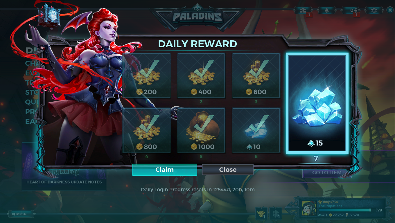
Daily login modernization

The old login calendar ran 30 days, and missing a day set you back. I shortened it to seven days and let players claim on their own schedule, so they still have a reason to come back without being penalized.

Seven days meant fewer total rewards. I decided removing the penalty mattered more to players.

Daily login modernization
04

Boutique champion UI

Designed, implemented, and animated unique devices that track each champion's abilities. Engine restrictions meant no runtime animation, so every state was hand-animated as a PNG sequence.

← All work
Hi-Rez Studios PC / Console Live service System Designer

Smite 2

A third-person MOBA rebuilt in Unreal 5. Smite has players who've been with it for ten years. My job was to make the UI clearer and give each god more personality, without moving things those players already knew.

Role

Senior UI/UX Designer, system design

Responsibilities

System design and implementation, boutique character ability UI, in-game ability quick view, resource-management legibility, themed UI

Team

Game designers, engineers, and artists

Tools

Figma, Adobe CC, Unreal Engine

Timeline

Jan 2024 to Sept 2024

Smite 2
01

Boutique character systems

The original Smite had ability UI that was inconsistent from god to god and inefficient to read mid-fight. The rebuild had to make resource management unmistakable and give each god as much of their own look as the engine could handle.

When readability and theming conflicted, I chose readability. Every god's device is read the same way, and the theming fits around that.

Jing Wei's device below is one system in its states: base, then each bird charge, then the VFX shape. The theme is tied directly to the resource, so the art itself tells the player how many charges they have.

In gameplay, the devices sit in the corner of the screen and can be read mid-fight without looking away from the god.

Each god looks different. They all read the same way.

Jing Wei ability device, base state
Jing Wei ability device, one charge
Jing Wei ability device, two charges
Jing Wei ability device, three charges
Jing Wei ability device, VFX shape
02

An ability quick view, in gameplay

MOBAs expect you to remember what every ability does, even on a god you picked ten minutes ago. That's hardest on new players and anyone trying a god for the first time.

I designed an in-match quick view that shows a short version of each ability's description in the match, with animation and highlight states making locked, upgradable, and upgraded abilities readable without stopping to parse text.

I kept it to a short summary because players usually open it mid-fight.

03

Redesigning a game people already love

Returning players judge every change against the version they already know by heart.

I fixed what was inconsistent, kept things where players already knew to find them, and put new ideas into theming instead of moving things around.

← All work
Zynga Mobile Live service Designer · UI Artist 2014 to 2019

Wizard of Oz: Magic Match

A three-year-old match-3 title losing revenue every week, played mostly by women aged 45 to 60. Four programs over two years: two new features, a UI update that we had to roll back before it worked, and an outsourcing process I set up from scratch.

Role

UX Designer and UI Artist

Responsibilities

User research, flow charts, wireframes, interactive prototypes, FTUE design, UI art, RFP authoring, outsource direction

Team

One designer, one artist, and one remote developer per feature, inside a team of two designers, two artists, and three developers

Tools

InVision, Photoshop, Illustrator, After Effects, Unity, Jira

Timeline

May 2014 to Sept 2019

01

Daily retention, on the second attempt

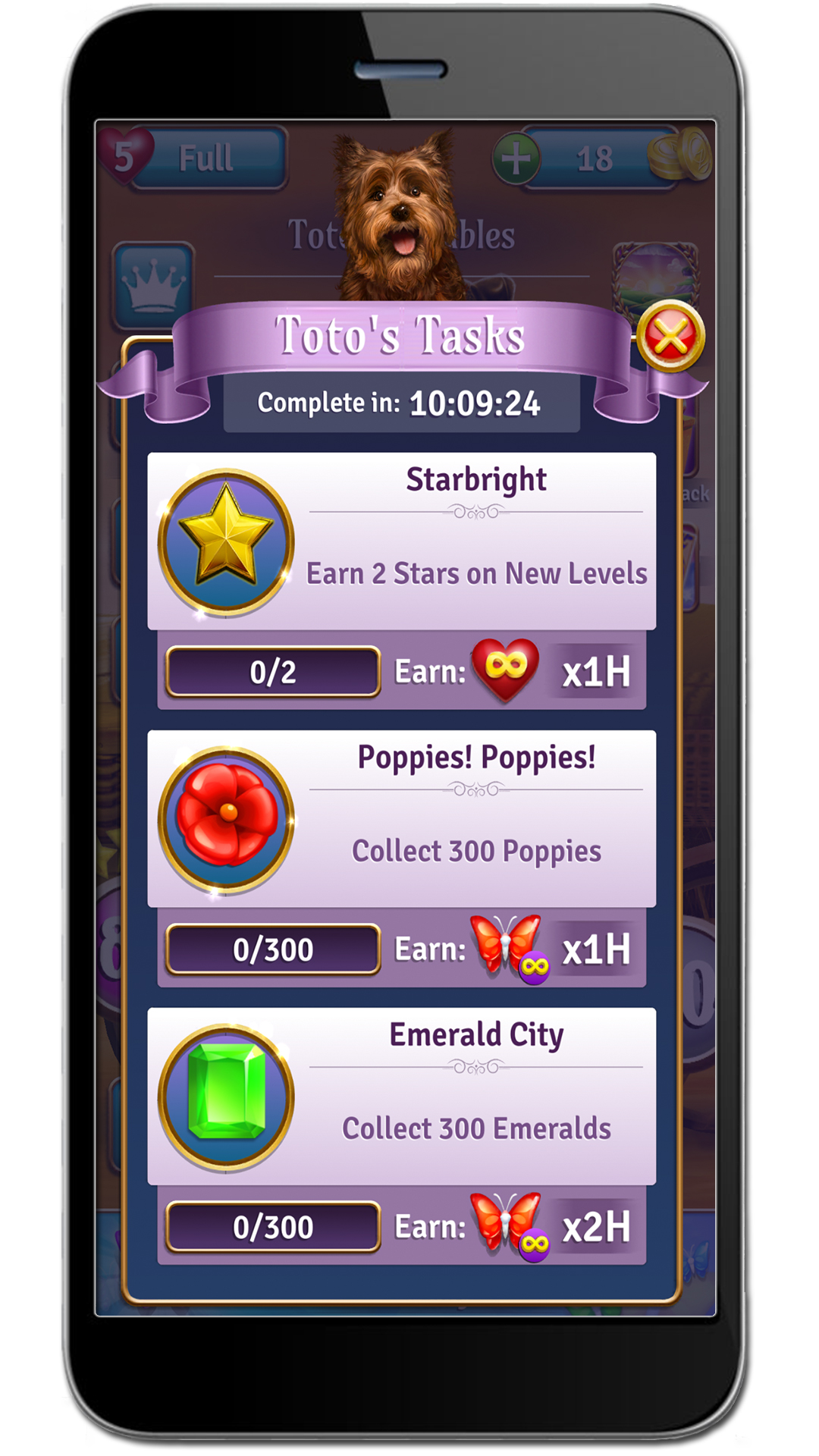
The team had already shipped a feature like this once and missed the target. I went back to find out why. Message analytics and player conversations showed the instructions were too long and felt like a chore, and that players resented anything interrupting the core loop.

For the rebuild, I kept it outside the core loop and used a character to introduce it instead of a task list. On an aggressive deadline I cut the art cost to one pose and one face, changing costume and color per level, then carried that level color through the rest of the feature as a progress cue.

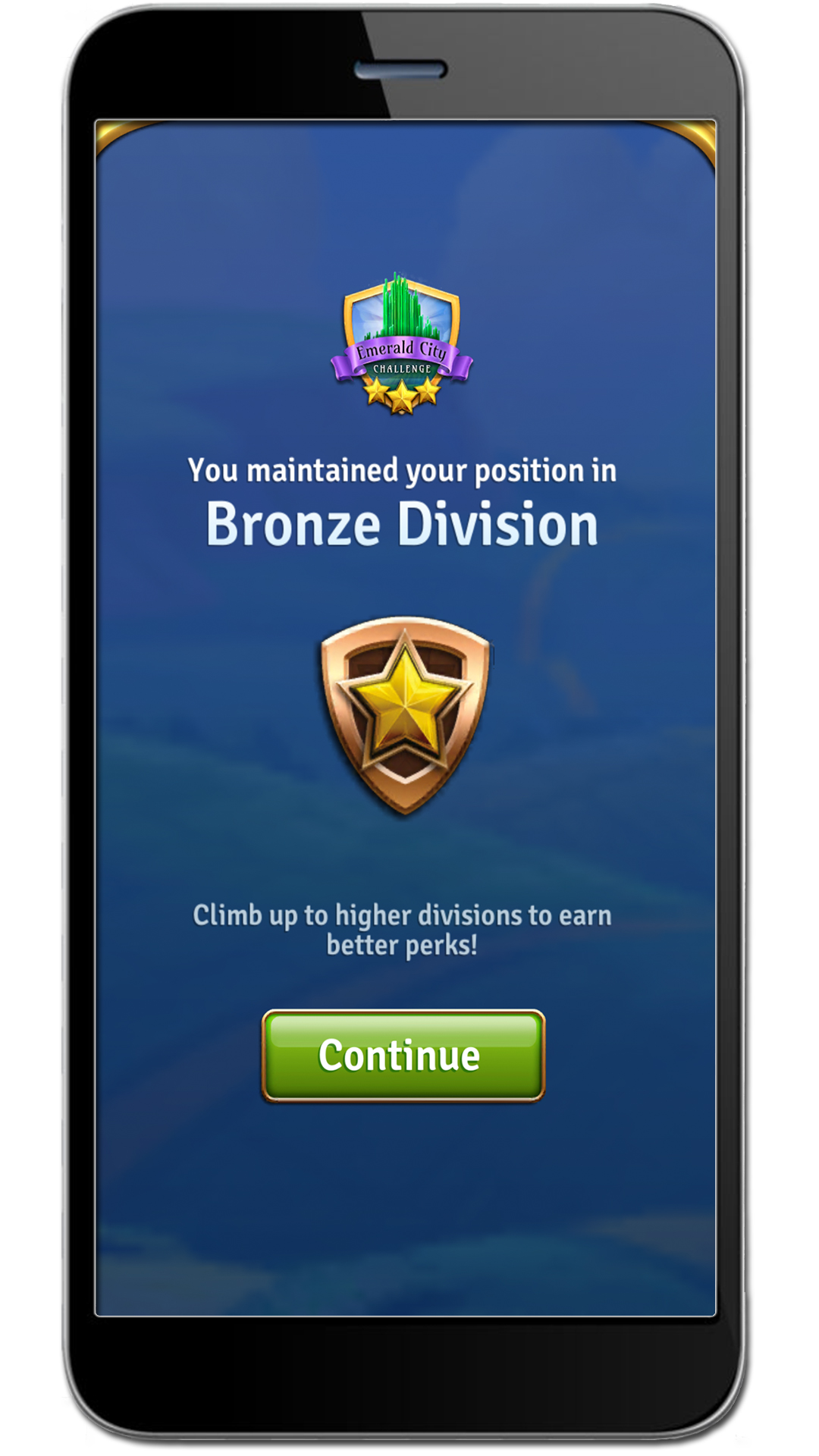
Up about 5% monetization and 3% logins within two weeks.

Daily retention feature
Handling a late requirement

At final review, a stakeholder added a requirement that was not in the acceptance criteria and would not ship without it. It also broke the core flow, which our research said players didn't want changed.

Instead of adding a step, I proposed an alternate ending animation that satisfied the request without adding a step. Our developer and I wireframed it the same day, got approval, and shipped on time. Afterward I added a flow-chart review with stakeholders to the process, so new requirements came up earlier.

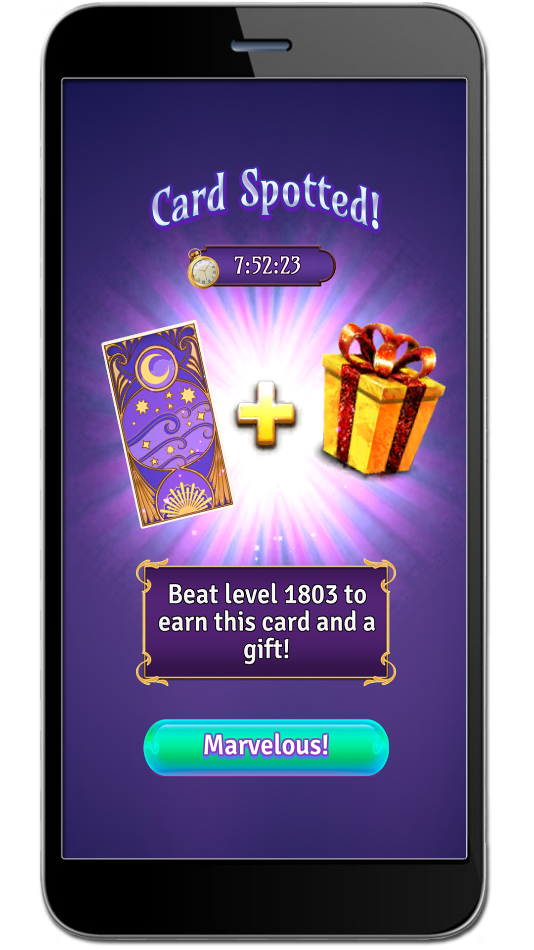
Card collection event
02

A card-collection event for an audience that hates complexity

Stakeholders wanted a new kind of experience inside a game whose players were 82% women, most of them between 45 and 60. Card collection is a mechanic built by and for a very different audience.

I audited the established players in that space, Elder Scrolls: Legends and Shards of Infinity among them, and played them daily for a week keeping my own notes so the wireframes were based on what I'd seen work. Post-its to whiteboard to flow chart to graybox, then art swapped in screen by screen.

Internal testing across teams outside QA said the instructions still confused people. I added an FTUE screen explaining duplicate cards, upsized assets, and animated every tappable element.

About 6% monetization lift over the first limited run.

04

Modernizing the UI

Year three, revenue sliding about 0.03% a week, and years of added features had made the screens cluttered and new features hard to notice. I stripped the decorative characters, moved the header up to read as progression, simplified copy, raised contrast, and left the store buttons where players were used to finding them.

We launched it. Sales dropped. We reverted inside days and sales recovered, and the interviews explained why: players liked the new UI. They just did not want their screens changed.

The problem wasn't the design. Players needed changes to happen gradually. So every new feature shipped in the modern style, while existing core screens changed only in small increments as players acclimate. The first feature built that way lifted daily users about 0.06% and monetization about 1.2%, and the core screens went onto a five-part roadmap across the following year.

Original UI before the pass
Old UI kept, copy simplified
New UI, duplicated framing removed
05

Outsourcing level content

Two designers, two artists, three developers, new level content due every two weeks, and no documented process for any of it. I wrote the RFPs and ran the outsourcing myself.

I trialed two vendors against the same brief to see which asked questions when confused, built documentation that paired visuals with written instruction, and shipped a library of blank templates pre-set to the right ratios and guides so files came back set up correctly. We also had regular check-ins where they sent progress and I sent feedback, so problems were caught early.

Every miscommunication went back into the documentation. It ended up doubling as onboarding material for new hires.

Within three weeks and six check-ins, the vendor was delivering finished content without help from the internal team.

06

Also at Zynga: Wizard of Oz and Willy Wonka Slots

Alongside Magic Match I worked the studio's slots titles, which helped bring Zynga's Austin office back.

Brand compliance

Designed within licensor guidelines for two well-known IPs, clearing art and UI through client review.

VIP program

Worked on the experience for the highest-value players.

Pre-production strategy

Developed saleable concepts early enough to shape what got greenlit.

Visual Design

Graphics

In-game animations and VFX

Enlarged graphic
{{ lbCount }}
← Back to work

{{ r.name }}

{{ r.title }}

{{ r.summary }}

Experience

{{ job.company }}

{{ job.dates }}

{{ job.title }}

  • {{ b }}

Education

{{ ed.school }}

{{ ed.dates }}

{{ ed.credential }}

{{ ed.note }}

Skills

{{ grp.label }}
{{ it }}